Soapberry
Branding
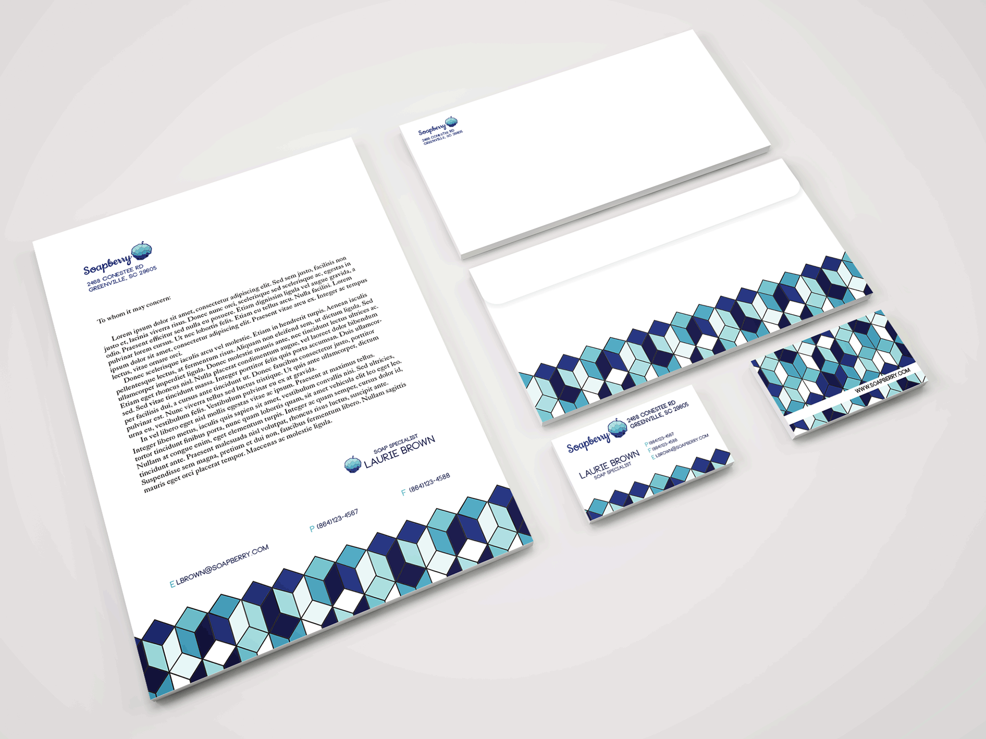
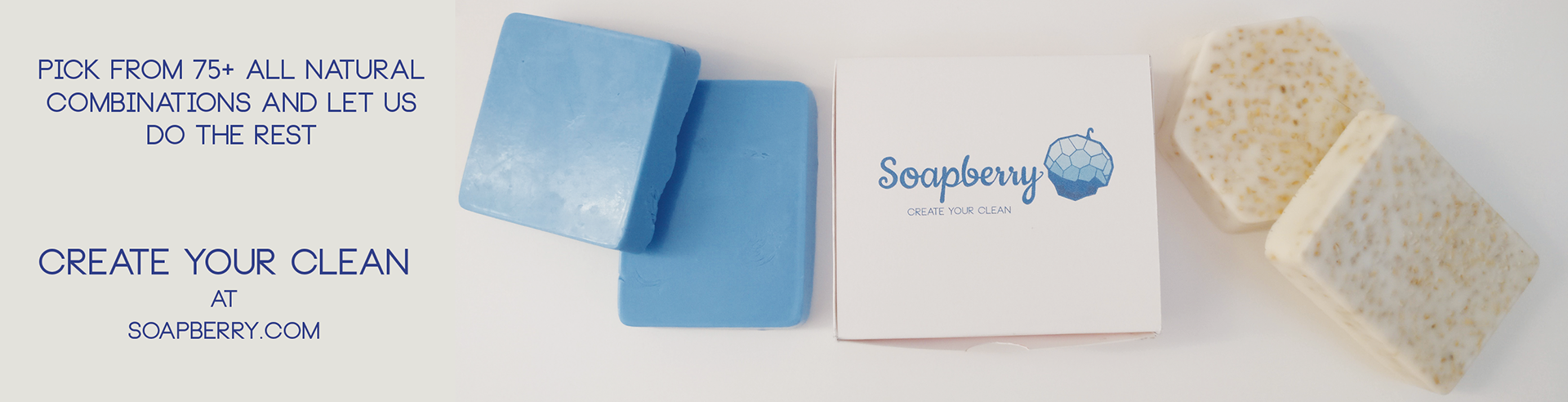
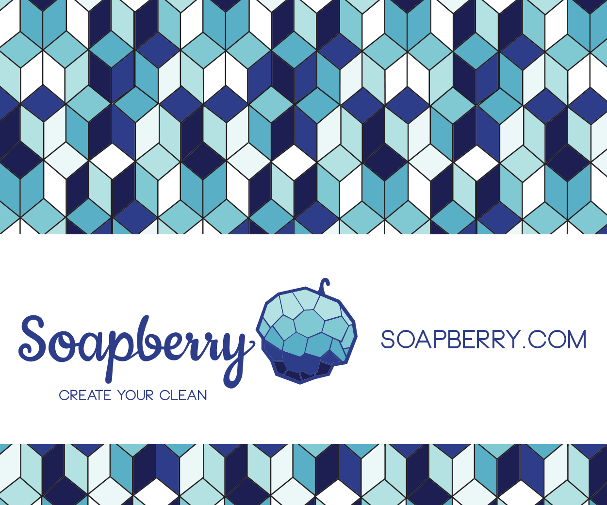
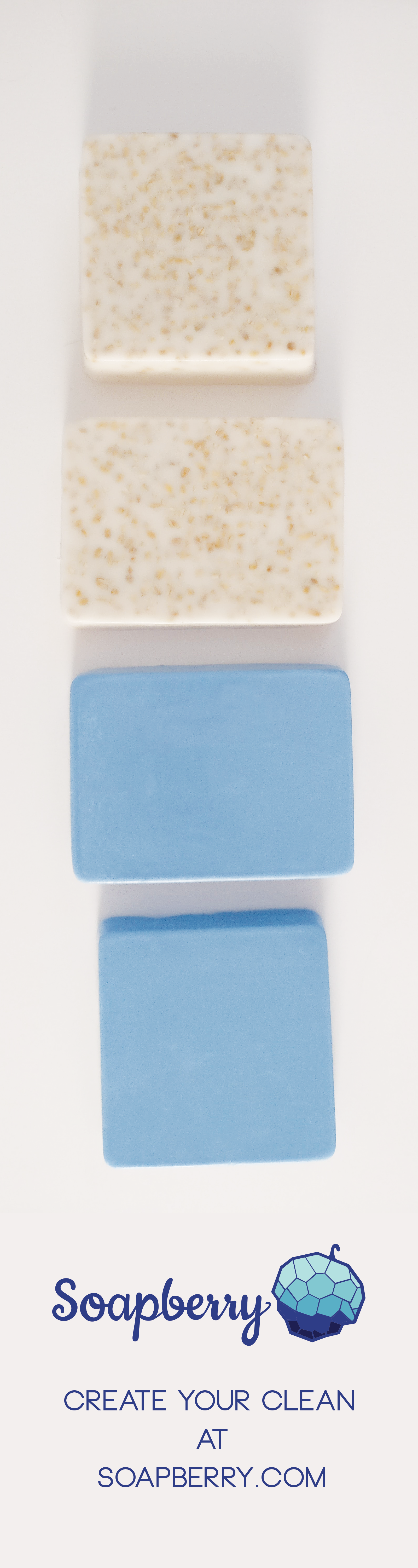
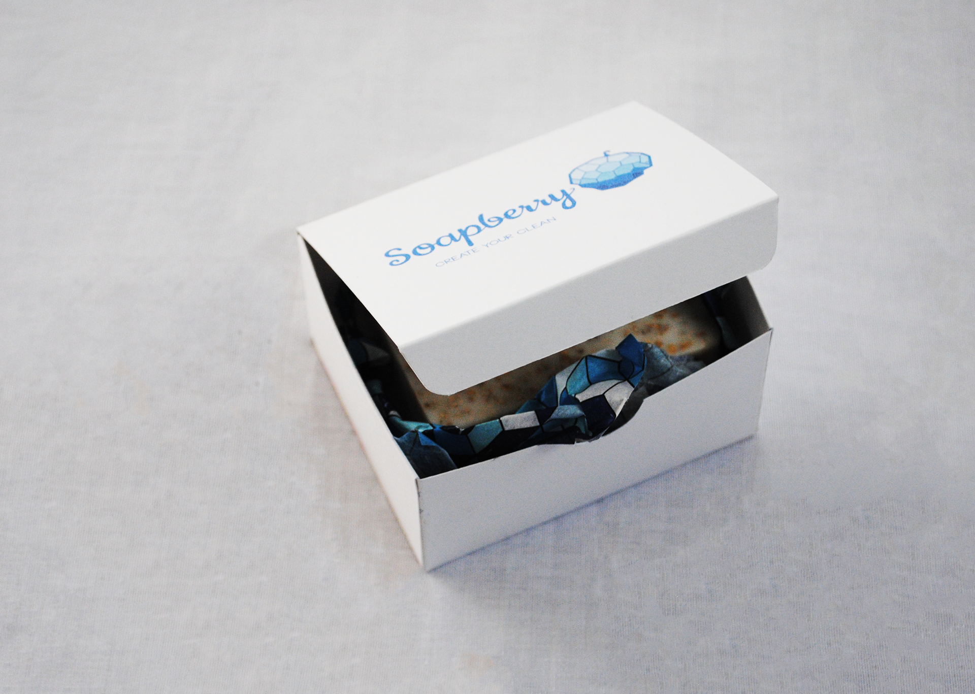
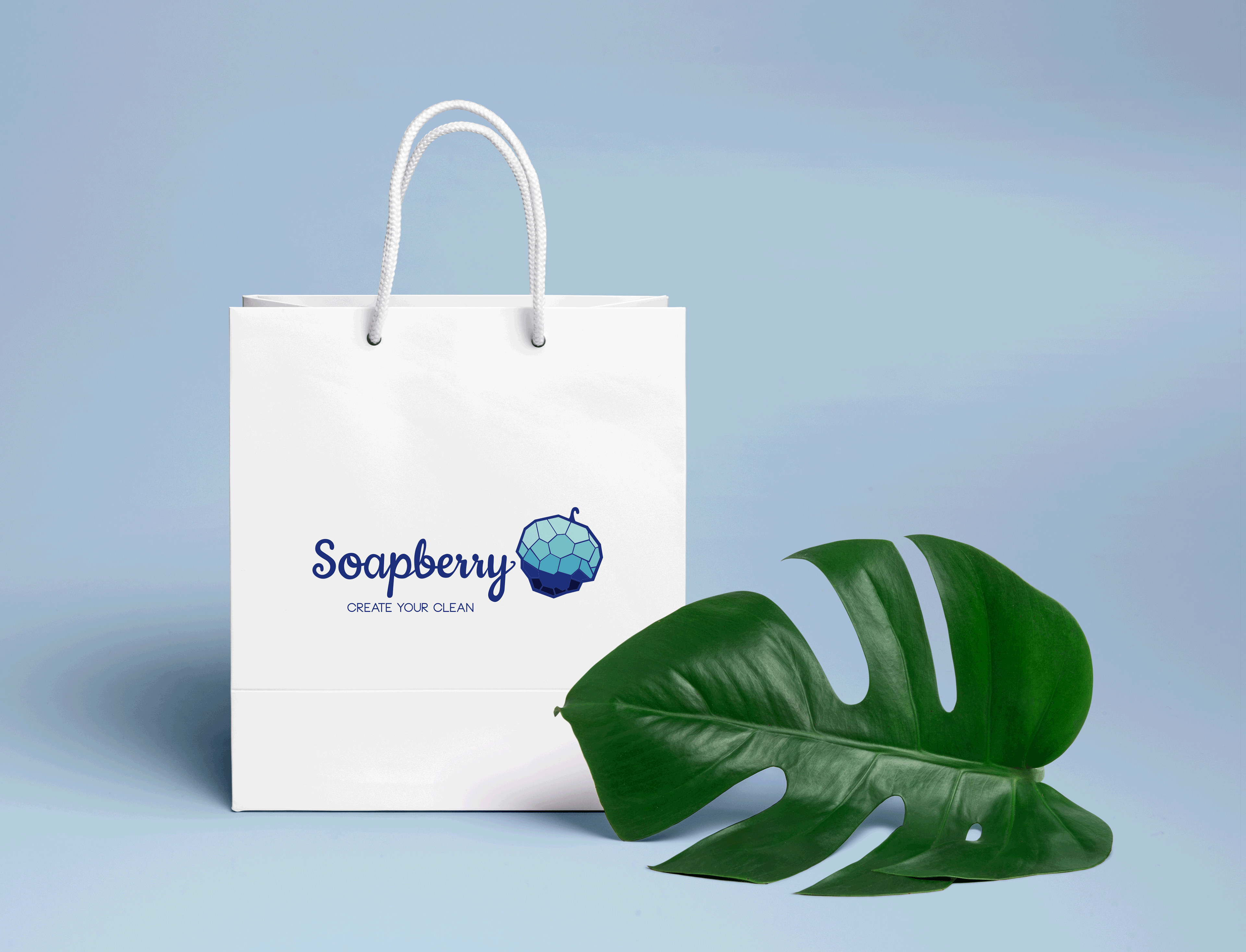
A visual identity system for a custom soap boutique in Greenville, South Carolina.
The mark and pattern are inspired by the shape created when multiple bubbles collide. The logotype is a modified script based off of the typeface, Cookie. The color palette uses bold blues to contrast with bright whites to evoke the feeling of cleanliness.
The mark and pattern are inspired by the shape created when multiple bubbles collide. The logotype is a modified script based off of the typeface, Cookie. The color palette uses bold blues to contrast with bright whites to evoke the feeling of cleanliness.